Friday, May 7, 2010
Lexus Headquarters Presentation
Over the past few months, me and a group of 3 other girls spent a few hundred hours working on an Integrated Marketing Communications Plan for the Lexus CT200h, Lexus' future first hybrid premium compact. The result of all our hard work? A 76 slide deck, 60+ page report, 25-minute sales pitch in front of my advertising professor, and a final invitation to pitch our advertising campaign to Lexus' VP of Marketing. I can't publicly share the details of our campaign, but I can share a lot of the lessons I learned while working on the IMC Plan, my experience at Lexus, and some cool pictures I took while I was there. Check back in a few days for a more detailed update!
Blog Transition
Writing has always been one of my least favorite subjects throughout all of high school and college. Beyond texting and instant messaging my friends online, I have never written anything out of recreation or anything I didn't feel like I had to write.
When I first started this blog, I saw it as a burden and something I just had to do to pass my WRIT340 class. I hated it at first but as I continued to blog, I started to realize that there's something really therapeutic about being able to not only express my opinion to a bunch of strangers online, but my opinion about the things I care about and in a writing style I can call my own.
As the end of my junior year fast approaches, I am no longer required to update this blog as part of my WRIT340 class. I want to make clear however, that I want to continue to update this blog - perhaps more than I have in the past now that I have more time.
I will continue to post serious blog posts in response to news and other blogs, as I have been doing, but I also want to start blogging about my own personal experiences that are relevant to advertising and design. To make things easier for those who only want to follow one or the other, I will separate them into 2 different folders/tags in the navigation bar.
Stay Tuned!
Thursday, April 29, 2010
Spotlight: Benny Gold

Freelance designer turned entrepreneur, and all-around good-guy Benny Gold is someone I’ve been following online for almost a year now and someone I really want to share with all of you loyal readers out there. (I’m looking at you Jeffrey Smith!) Benny started out as a freelance designer working for design firms and ad agencies out of college, but has really blown up over the past couple of months. Just earlier this week, Benny opened up his first flagship store in San Francisco with his own signature clothing line. Already, Benny has a solid (and growing) fan base online.
This is of course not without reason. There really is a lot to appreciate about Benny's clothing line, Benny’s brand, and Benny himself – each of which I’d like to take a look at little more closely (some in more detail than others).
Benny’s Clothing Line
Benny, first and foremost, is not only passionate about what he does, but he’s also good at it. There are a ton of “designers” and streetwear label owners out there that aren't actually trained in the discipline of design and it really shows in their clothing lines. In fact, most of the biggest labels in the “underground” streetwear scene such as Supreme and The Hundreds are so poorly designed, that they would never be able to sell 90% of the items that they put out if it weren’t for the hype and mindless consumerism surrounding them. To see what I mean, let’s take a look at some specific pieces that Benny’s competitors have put out recently:

There’s really nothing negative I can objectively say about the item above in terms of design. I mean… It’s a plain black anorak jacket, how can anyone hate on that? Some might even say that Supreme did a good job designing this piece. The thing is, Supreme didn’t actually design anything. All Supreme did was add a red patch that says, “Supreme” to an existing black North Face Jacket and doubled the price. You know what the crazy thing is? They sold like hotcakes! They attracted lines outside their stores on the day of their release (less than a month ago) and were sold out within hours. If that’s not brand-whoring


The Hundreds has a great bomb logo working for them. The problem is… they do a really poor job incorporating it into their clothing designs. The first t-shirt has a scanned sketch of The Hundreds logo on a crumpled piece of notebook paper prominently placed on it. But that’s it. There’s no sense of movement, variation, or overall sense of unity with the t-shirt itself nor is there anything aesthetically pleasing to look at or interpret. The second t-shirt has a little more going on, but the concept and execution is terrible. The typeface is awkwardly placed, the effects are cheesy, and again there’s no overall sense of unity between the design and the t-shirt itself. Curiously, The Hundreds has managed to remain one of the top streetwear labels in the industry.
The thing that sets Benny apart from his competitors is that he actually went to an art school, has a good eye for design, and puts it to use in his clothing line. Let’s take a look at one of his upcoming pieces below to see what I mean:


As Benny’s first pair of raw denim that he’s about to release, I’d say that Benny has done a pretty good job here. Elements of Benny’s logo (a paper plane), mantra (Stay Gold), and other design elements are very well incorporated into the product itself; the jeans have gold hardware, gold selvage stitching, a gold standard screenprint, and even paper plane trail stitching on the back pocket. Unlike Supreme and The Hundreds, Benny clearly has put a lot of work designing this pair of denim and made sure that his design decisions contributed to an overall sense of movement, variation, and unity to create a highly detailed product that is also aesthetically pleasing to look at. You know what the best part is? They sell for less than the raw denim pieces offered by Supreme and The Hundreds.
Benny’s Brand
Like Benny’s clothing line, Benny’s brand and what it stands for is pretty well thought out. In a video highlight with Hypebeast, Benny explains that his paper plane logo is a symbol of youth, but when in motion, is also a symbol of growth. Benny’s mantra, Stay Gold serves as a reminder for us to “stay youthful and make time for the things (we) enjoy in life.” In an interview with SFstation, Benny reiterates this point further by explaining, “our youth mentality and the things we hold dear are the real gold inside all of us.” Cheesy? Maybe, but it's much more inspiring than "The Hundreds is Huge," or Supreme's motto of "IDGAF.” To clarify, “The Hundreds is Huge,” means… well, the Hundreds is pretty big; IDGAF stands for “I Don’t Give A Fuck,” which is pretty self-explanatory. Personally, I like Stay Gold better, but that’s just my opinion.
Benny Himself
If you can’t appreciate good design and don’t care for what Benny's brand stands for, you have to at least be able to appreciate the fact that Benny is a self-starter and a genuinely nice person. To Supreme and The Hundreds’ credit, the people behind those brands are self-starters too, but they and the people that operate their stores aren’t very nice. This isn’t just my opinion; it’s the general consensus on every online forum dedicated to these brands (see here, here, and here). Benny on the other hand stays grounded, keeps in touch with his growing fan base, and continues to be an active participant in the online communities that support him.
Before ending this post, and opening it up for discussion, I want to clarify that my goal in writing this post was not to make a strong argument against Supreme and The Hundreds or a strong argument for Benny Gold. Clearly, Supreme and The Hundreds have some well-designed pieces and Benny Gold, some not so well-designed pieces; I happen to own pieces of clothing from all three labels. My goal was to share my overall opinion, based on my own experiences as well as the experiences/opinions of others, that Benny is highly deserving of the attention that he has been getting as well as do my part to contribute to his continued success.
Spotlight: Benny Gold Draft

Freelance designer turned entrepreneur, and all-around good-guy Benny Gold is someone I’ve been following online for almost a year now and someone I really want to share with all of you loyal readers out there (I’m looking at you Jeff Smith). Benny started as a freelance designer, working for design firms and ad agencies out of college, but has really blown up over the last couple of months. Just earlier this week, Benny opened up his first flagship store carrying his own signature clothing line in San Francisco. Already, Benny has a solid (and growing) fan base online.
This is of course not without reason. There really is a lot to appreciate about Benny's clothing line, his brand, and Benny himself:
Benny, first and foremost, is not only passionate about what he does, but he’s also good at it. There are so many “designers” and streetwear label owners out there that aren't actually trained in the discipline of design. Most of the biggest labels in the “underground” streetwear scene such as Supreme, The Hundreds, and Diamond Supply Co. put out pretty mediocre stuff 90% of the time. Without the hype and mindless consumerism, most of the stuff they carry would never sell. It's hard to explain how their stuff is poorly designed without getting pretty technical and/or subjective, but I can if any of you readers out there want me to. Just keep in mind that all of this is coming from someone who is into the streetwear scene and really appreciates the culture surrounding it, but is also studying design and knows (or at least thinks he does) bad design when he sees it. What sets Benny apart is that he actually went to an art school, has a good eye for design, and puts it to use in his clothing line.
Benny’s brand, and what it stands for, is also pretty thoughtful and reflective of the transitioning point in his life (as well as that of his fans). In a video highlight with Hypebeast, Benny explains that his paper plane logo is a symbol of youth, but when in motion, it’s also a symbol of growth. Cheesy? Maybe, but it's much more inspired than "The Hundreds is Huge" or Supreme's motto of "IDGAF."
If you can’t appreciate good design and don’t care for what Benny's brand stands for, you have to be at least be able to appreciate the fact that Benny is a self-starter and a genuinely nice person. He started out just putting up stickers, the same way Shepard Fairey did, but has really grown over the years and is on his way up to be the next Johnny Cupcakes (if you don't know who Johnny Cupcakes is, make sure you peep the link; he has a great story behind his brand). Personally, the reason why I connect so well with Benny is because one of my (tentative) life goals is to be someone like him - the Creative Director of my own clothing line and business.
OTHER LINKS
[Video] About Benny Gold
[Video] Benny Gold Store & Office Tour
[Blog] Benny Gold Blog
UPDATE 04/30/10
Wow. Within hours after I posted this, Benny actually made a blog post about Johnny Cupcakes. What a coinkidink! I wonder if Benny noticed I linked to his blog and am saying all this good stuff about him. If so... hi Benny!
Hood Rich

via Abstruse Goose
One of the things that my Product Development and Branding professor said to my class, on the last day of classes, that really stuck out to me was "If you want to be a millionaire, don't live like one." This philosophy is, of course, nothing new. Proverbs 13:7 reads, "One pretends to be rich, yet has nothing; another pretends to be poor, yet has great wealth." Regardless, what my professor said made me think pretty deeply about the financial situation we're in and more specifically, the friends I know who contributed to and still continue to contribute to it.
I grew up in a neighborhood in Boston that had some of the most affluent people in the city and others living off welfare checks within a 1-mile radius of each other (I kid you not, look up 02116 on Claritas if you don't believe me). What I saw, and what I still continue to see each time I go home to Boston is a really sad sight: people with 10 credit cards maxed out, driving in expensive cars in $80 t-shirts through the ghetto, living "LA lifestyles" they can't afford. These people aren't rich. They're hood rich. They've dedicated their entire lives chasing after money and have convinced themselves that in order to be happy, they need all of these material things to show off their (false sense of) wealth. It's really sad. What these people need isn't more money. What they need is Jesus (just kidding... but not really). Some advice from Warren Buffet and this book could help too.
[I'll finish this post later]
Saturday, April 24, 2010
Benjamin Gets A Facelift
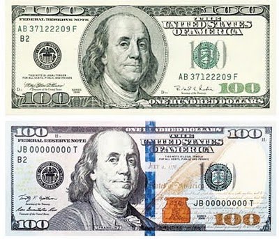
Earlier this week, the U.S. Treasury unveiled a new $100 bill with an incredible amount of changes as well as some new security upgrades - most noticeable of which include an obtrusive blue "3D Security Ribbon" and "Bell in the Inkwell" that can only be seen at certain angles. According to the Federal Reserve's official press release, these new additions and overall changes are meant to combat counterfeiting while still keeping in line with the traditional look of U.S. Currency (even though it's no longer green...)
I think it's great that the U.S. Treasury has finally redesigned the $100 bill and has consequently joined the ranks of the world's most eye-catching currencies. My biggest concern however, is how the U.S. plans on preventing people from forging and using older currency if older $100 are still considered legal tender. According to the Chairman of the Federal Reserve Board, Ben S. Bernanke, "When the new design $100 note is issued on February 10, 2011, the approximately 6.5 billion older design $100s already in circulation will remain legal tender, U.S. currency users should know they will not have to trade in their older design $100 notes when the new ones begin circulating." Can someone please enlighten me on this?
UPDATED 04/30/10
Just for shits and giggles, I made some shitty mockups of fake currency, that's based on the dutch guilder and euro, on Adobe Illustrator:


Saturday, April 17, 2010
Exit Through The Gift Shop: An Informal Review
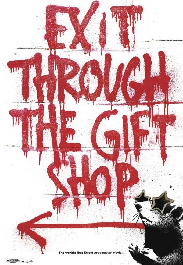
I saw Exit Through the Gift Shop yesterday. It opened on Friday and is currently playing in select theaters in New York and California. In Los Angeles, you have the option of seeing it at either the Landmark or Arclight Cinema. Personally, I recommend going to Arclight Cinema in Hollywood and getting there early because the venue itself is really nice – there’s a bar, a gift shop, and it’s right on Sunset. Also, reserve tickets online as seats are individually reserved. The best seats are in the lower middle section, but there really isn’t a bad seat in the house as long as you’re centered with the screen.
As for the movie itself, I think it’s best watched and appreciated without truly knowing what the movie is about. Watch the trailer here but don’t read any movie reviews on it; they give too much away. Without completely spoiling the movie, Exit Through The Gift Shop is billed as a Banksy Film, advertised as “The world’s first Street Art disaster movie” on www.banksyfilm.com, was the biggest hit at the 2010 Sundance Film Festival, and has a 98% “Fresh” rating on Rotten Tomatoes.
Personally, I loved the movie. It’s really different from all the other movies out there; it’s smart, entertaining, and made me really think about street art (and the hype and commercial aspects surrounding it), and the art world in general – much more so than Beautiful Losers, which I liked but didn’t love. I watched Exit Through The Looking Glass with mostly non-artsy people who aren’t really in-tune with street art and they thought it was really interesting too. So whether or not you care about street art or art in general, you should watch it.
MORE LINKS
Los Angeles Movie Premiere [Pictures] [Video]
Street Marketing/Graffiti [1] [2] [3] [4]
Thursday, April 15, 2010
Ogilvy & Mather: An Informal Recap Of My Visit
I visited the Los Angeles division of Ogilvy & Mather yesterday morning for a short tour, presentation, and a Q&A session with a panel of workers from both the account and creative side of the advertising agency.
I left with pretty mixed feelings.
The first thing I noticed about the place, and the area surrounding it, was that it is very industrial looking. The first thing you see when you walk in is a big metal cylinder (with TVs hanging from the sides) that you have to walk through to get to the offices and conference rooms. The metal cylinder looked like it’d be a boatload of fun to skateboard in but it didn’t seem very practical; if I were a client, I don’t know how I’d feel about seeing a giant metal cylinder, which blocks the receptionist, as the first thing I see when I walk into the building.
The “cubicles” and offices were very open (no privacy much?), but the cubicles, and area overall, seemed really cramped to me. The one exception was the conference room, which had a pool table and basketball hoop. Noticeably absent however was a ping-pong table, which was a staple in other advertising agencies that I have been to and better identified with.
The presentation wasn’t bad but the sample creative work they showed me wasn’t very inspiring.
The people who worked there seemed pretty cool though. Most of what they told me was stuff I already knew, but very useful for anyone trying to get into a good ad agency. One person shared his story of how he made the transition from being an Account Executive to a Copywriter. Another person mentioned that if you're lucky enough to get your resume and cover letter read, and get extended an interview, you have to be pretty knowledgeable about the agency to actually get the job. This is pretty standard for any job you apply to, but I found this to be overwhelmingly true (much more so than with more typical jobs) with the advertising agencies that I have interviewed with. All the agencies I interviewed with in Boston spent at least 10-15 minutes of the first round interview just asking me stuff about their own company (ie. who their CEO is, who their biggest clients are, what clients they just got, what creative work they’ve done and which I identify most with, etc). Advertising agencies attract a lot of great talent and generally have a very strong culture, so my advice to anyone trying to get in would be 1) have the company extremely well-researched, 2) be prepared to tell them what their values are, and 3) be prepared to explain how you also have these same values.
Puma's Clever Little Bag

As part of a huge long-term sustainability program, PUMA teamed up with renowned industrial designer Yves Béhar to develop a new package design for PUMA's line of sneakers. The new packaging "uses 65% less cardboard than the standard shoe box, has no laminated printing, no tissue paper, takes up less space and weighs less in shipping, and replaces the plastic retail bag."
Now, I've gone through a few pairs of PUMAs in my life and was never really a big fan of them, but I have to admit that PUMA's new Clever Little Bag is... well, pretty clever. Besides the obvious fact that it's better for the environment and cheaper for PUMA to do something like this, the new packaging and overall effort to be green is a great way for PUMA to position itself away from it's major competitors and get positive publicity. I don't know if I'd use the bag for carrying groceries, but I could definitely imagine myself using PUMA's new bag to carry an extra pair of shoes (PUMA or not) around with me, which would inevitably result in even more free advertising for PUMA.
If you wanna see more pictures, visit here. Peep the video above too if you haven't already. It's short, catchy, and very well designed.
UPDATED 04/30/10
There's a lot of conversation going on on YouTube poking fun at the fact that it took 21 months to figure out that "you don't need boxes to sell sneakers." 21 months really isn't that long when you take into consideration how much testing needs to be done, how big of a decision this is considering how many shoes PUMA sells annually, and all the different levels of hierarchy involved in a company such as PUMA to approve something like this.
Tuesday, March 30, 2010
Eco Coke Bottle Design
Here's a bottle design (CLICK IT!) that has garnered an insane amount of attention on Digg as well as the overall blogospheric community:

The design is just a mockup, which means it won't actually go into production, but the fact that it was designed by a freshman student at CCS and has received so much attention thus far, is truly impressive.
It's worth noting however, that even though the way the product and it's features are presented (as well as the typography, photography, and layout involved in the process) is exceptional, the product design itself is not very practical.
There's a very clear reason for the way coke bottles and cans are designed the way they currently are.
I wish I had a link to prove this but I remember learning in my Calculus BC (oO0O0!) class in highschool that typical soda cans in the US are shaped to carry 12 fl oz of beverage with the least amount of aluminum necessary. The reason why cans aren't equal in width and height is because the tops and bottoms of cans are thicker and thus require more aluminum. The same is true about plastic bottles and plastic.
As for square shaped bottles, they would actually require more plastic to carry the same amount of volume as a cylindrical bottle. Here are the equations for the surface areas of rectangular prisms and cylinders if you wanna do the math out yourself.
Also, I don't think a thin rectangular-shaped bottle would be able to handle the stress of the carbonation inside coke, but then again I'm not an engineer (though I was once declared as one) so I wouldn't know. The only bottle I know of that's rectangular shaped is Fiji and last time I checked, that shit ain't carbonated. Please enlighten me if I'm wrong.
There's a million other reason out there too, I'm sure, as to why something like this would never go into production and why coke bottles are designed the way they are today (feel free to add your reasons in the comment section) but again, this is just a concept design (and a very good one from an aesthetic point of view) made by a freshman design student - there's no need to be any more of a bottle-design-nazi than I am already being.
Unbranded Branding

As a student studying both Business and Fine Arts with the dream of one day becoming the Creative Director and owner of my own clothing label, one topic that I follow closely is marketing trends within the fashion industry.
One trend that I have noticed over the past couple months is that there has been a small shift towards unbranded branding. To clarify, an item that is unbranded is an item that does not carry a brand or brand name. This is not to be confused with an item that is debranded, which implies that it does not carry any type of brand name, packaging, or material that would otherwise allow someone to identify a brand.
For the purposes of this blog post, I would like to specifically take a closer look at Freshjive’s new line of “logoless” clothing and Urban Outfitters' new line of “unbranded” denim. I will explain what market each line competes in, what each line’s public rationale for going “unbranded”/”logoless” is, and how each line’s public rationale is different from (what I think) is its actual reason(s) for going “unbranded”/”logoless.”
FRESHJIVE
Let’s begin our discussion with Freshjive. Freshjive was founded in 1989 by Rick Klotz as one of the originators of streetwear – a distinctive style of fashion rooted in the underground skateboard scene. Although Freshjive has remained moderately well-known within in the “underground” skateboard and hip-hop community, it has (since its origination) been well-surpassed by other leading streetwear labels such as Supreme and The Hundreds, both of which are similarly priced and styled.
In - what some have called - a bold move, Freshjive announced a few months ago that that they "will no longer be using (their) brand logo or name on any of (their) product, including all labeling and t-shirt designs.”
In an interview with Bobby Hundreds (the co-owner of The Hundreds), Rick Klotz elaborates:
"Throughout the years I’ve become uncomfortable with this business of branding and brand identity. I’m not the type of person that buys something for the brand name. I’ve also never done a very good job at creating a captivating identity to our own brand logo. Also, within the streetwear culture, the promotion of a company’s brand has become downright silly to me. What’s amusing is I still really enjoy designing gear, graphics, and even logos. But when I see kids wearing company logos it reminds of people who are trying to be a part of a “tribe” or “gang”, as if they need to be part of something, which seems to go against the idea of individualism in style."
When asked by Bobby Hundreds what Rick will call his new line, Rick responds:
"Well, let’s be practical. The company is still Freshjive. It’s just that none of our product will have any of our logos or even our name AT ALL. Not even in the labels. And after the turn of the year, no promotional material, nor our website will have any logos. It’s really invigorating to approach designing a line WITHOUT the constrictions of how the logo is gonna be placed or used on the garments."
Throughout the rest of the interview, Rick continues to explain that his move to go “logoless” stems from his disillusionment towards the “world of branding and marketing,” and that he is just “following his heart.” If this is, indeed true, I applaud Rick for making such a bold move and for “following his heart.” Unfortunately, my spidey-senses tell me that there are other reasons, bigger reasons, for why Rick is going “logoless.”
Now, the reason why I keep putting logoless in quotations is because Freshjive isn’t actually going logoless. Surely, that black rectangle with the white stroke around it is still a logo, even if the logo doesn’t have any text in it. If Rick is so against branding and marketing, and intent on getting rid of labels and logos, why is that black box with the white stroke around it on all of his clothing items and on his main website? Peep the pictures below to see what I mean:


The truth is… Rick isn't getting rid of brand logos and labels like he claims – it wouldn’t make sense for him to; he's just changing his old logo and dismissing this change as a punk move to garner support from his punk fan base, and free publicity from the press - all in an attempt to revitalize a brand that has been stagnant for years. Clearly it's working since even the Huffington Post ran a story on it… not bad for an “underground” streetwear label.
Freshjive, of course, is not the only company that has gone “logoless.” Urban Outfitters has used a similar tactic in its latest line of “unbranded” denim, but for different reasons. But before we get to that, let’s start take a brief look at where Urban Outfitters has been and where it is today.
URBAN OUTFITTERS
Urban Outfitters was founded in 1970 as an outlet for hip and funky clothing as well as unique household items. Unlike Freshjive, Urban Outfitters has (since its origination) remained very popular among both hipsters and the general mainstream. Though very differently styled, Urban Outfitters’ closest competitors include Abercrombie and Fitch, and Gap.
In a move that has received a lot of ongoing buzz among several online fashion communities (see here, here, and here), Urban Outfitters released, a few months ago, a new line of “unbranded” raw denim. For those out of the loop, it’s worth understanding what exactly raw denim is and who the major players in the raw denim game are. For those of you who already know and/or don’t care, feel free to skip the next 2 paragraphs.
Raw denim - sometimes referred to as dry denim - is a type of denim fabric that is not treated with any type of wash after being dyed during production. Unlike most denim sold at your local department store, raw denim is sold heavily starched, in a solid indigo color, and with no signs of wear or artificial distress marks. The appeal of raw denim is that it fades with wear to eventually look like a distressed pair of denim; this fading process and the fit and distress marks that result is completely natural and unique to the person who wears the denim. If you're an outsider of raw denim, this may come as a surprise to you but most users of raw denim (including Zac Efron and Kanye West) typically abstain from washing their jeans for 6 or more months to facilitate the fading process.
Urban Outfitters' Unbranded raw denim, specifically, is priced at $78 a piece, making them quite possibly the cheapest pair of selvage raw denim widely available. They are set to compete with Naked & Famous' own line of raw denim, which is similarly priced, and APC's line of raw denim, which is the similarly styled (but cost about $165 a piece).
On its teaser website, Urban Outfitters explains that:
"The Unbranded Brand is jeans with no name, no branding, no washes, no ads, no gimmicks. Just great denim at a great price! Wow, what a concept, only paying for the product itself... crazy, isn’t it?"
Urban Outfitter’s public rationale for going “unbranded” is pretty clear here so I won’t elaborate on it any further.
Now, the reason why I keep putting unbranded in quotations is because Urban Outfitters’ “unbranded” denim - as you might have guessed by now - isn’t actually unbranded. The brand itself is Unbranded. Urban Outfitters, of course, knows this and is calling its line Unbranded as a cheap gimmick to try to convince consumers that all they’re paying for is a high quality product without the associated advertising costs. Similar to Freshjive, Urban Outfitters has placed an unusually big leather patch above the right pocket to make sure that consumers are able to identify that the product is from Urban Outfitters even though it’s supposedly “unbranded.” It’s hard to tell from the pictures below, but the patch is huge in person as is pointed out in almost every single review on the product website.

It’s more than just a cheap gimmick to convince consumers that all they’re paying for is a quality product though.
Hopefully this post has helped to inform as well as shine some light on the idea of why some brands are going – or at least claiming to go - unbranded. Clearly, I’ve only touched the surface here, but my hope is that next time a brand claims to go “unbranded,” you will more deeply question the motives behind move, rather than just accepting what the brand tells you.
Monday, March 15, 2010
Freshjive Goes Unbranded
While we're still on the topic of Unbranded Brands, I thought it would be interesting to point out another clothing label that has chosen to go "unbranded."

Freshjive, a moderately well-known streetwear label among the hip-hop community, announced a few months ago that they "will no longer be using (their) brand logo or name on any of (their) product, including all labeling and t shirt designs.”
In an interview with The Hundreds, Rick Klotz, the owner and designer of Freshjive, explains:


As one reader commented, "just because the black rectangle doesn’t have a word mark embedded in it doesn’t mean its not a logo." Rick isn't getting rid of brand logos and labels like he claims, he's just changing his old logo and dismissing this change as a punk move to garner support from his punk fan base, and free publicity from the press, all in an attempt to revitalize a brand that's been stagnant for years. Clearly it's working since the Huffington Post ran a story on it.

Freshjive, a moderately well-known streetwear label among the hip-hop community, announced a few months ago that they "will no longer be using (their) brand logo or name on any of (their) product, including all labeling and t shirt designs.”
In an interview with The Hundreds, Rick Klotz, the owner and designer of Freshjive, explains:
"Throughout the years I’ve become uncomfortable with this business of branding and brand identity. I’m not the type of person that buys something for the brand name. I’ve also never done a very good job at creating a captivating identity to our own brand logo. Also, within the streetwear culture, the promotion of a company’s brand has become downright silly to me. What’s amusing is I still really enjoy designing gear, graphics, and even logos. But when I see kids wearing company logos it reminds of people who are trying to be a part of a “tribe” or “gang”, as if they need to be part of something, which seems to go against the idea of individualism in style."When asked by Bobby Hundreds what Rick will call his new line, he responds:
"Well, let’s be practical. The company is still Freshjive. It’s just that none of our product will have any of our logos or even our name AT ALL. Not even in the labels. And after the turn of the year, no promotional material, nor our website will have any logos. It’s really invigorating to approach designing a line WITHOUT the constrictions of how the logo is gonna be placed or used on the garments."My question is, if Rick is so intent on getting rid of labels and logos, why is there still a black box label/logo on most of his clothing items and on his main website?


As one reader commented, "just because the black rectangle doesn’t have a word mark embedded in it doesn’t mean its not a logo." Rick isn't getting rid of brand logos and labels like he claims, he's just changing his old logo and dismissing this change as a punk move to garner support from his punk fan base, and free publicity from the press, all in an attempt to revitalize a brand that's been stagnant for years. Clearly it's working since the Huffington Post ran a story on it.
Urban Outfitters Goes Unbranded
One brand of raw denim that has been getting some ongoing buzz for the past few months among several online fashion communities (see here, here, and here) is Urban Outfitter's Unbranded Brand. Urban Outfitter's teaser website reads: "The Unbranded Brand is jeans with no name, no branding, no washes, no ads, no gimmicks. Just great denim at a great price! Wow, what a concept, only paying for the product itself... crazy, isn’t it?"
For those out of the loop, raw denim - sometimes referred to as dry denim - is a type of denim fabric that is not treated with any type of wash after being dyed during production. Unlike most denim sold at your local department store, raw denim is sold heavily starched, in a solid indigo color, and with no signs of wear or artificial distress marks. The appeal of raw denim is that it fades with wear to eventually look like a distressed pair of denim and that this fading process and the fit and distress marks that result is completely natural and unique to the person who wears the denim. If you're an outsider of raw denim, this may come as a surprise to you but most users of raw denim (including Zac Efron and Kanye West) typically abstain from washing their jeans for 6 or more months to facilitate the fading process.
Urban Outfitter's Unbranded raw denim, specifically, can be purchased here at $78 a piece, making them quite possibly the cheapest pair of selvage raw denim available. They are set to compete with Naked & Famous' own line of raw denim which is similarly priced, and APC's line of raw denim which is similarly styled.
Word on the street is that Urban Outfitter's Unbranded denim is actually made by the same people who make Naked & Famous denim. I've actually had a chance to compare both in-person and can say that they do look and fit very similarly. My guess is that Urban Outfitter's Unbranded denim is just priced lower and stripped of Naked & Famous' branding to capture a more price-conscious target market without hurting the Naked & Famous brand name.
UPDATE 03/15/10
After posting about Freshjive, I wanted to add that Urban Outfitter's Unbranded brand is a brand in itself and is pretty gimmicky as well. Instead of using a black box with a white stroke, Urban Outfitter's uses a huge leather patch above the back pocket. It's hard to tell from the picture below, but it looks fricken huge in person.

Sunday, March 14, 2010
Print Ad - Gain Detergent
It's that time of the week again! Here's the third print ad I will be evaluating as part of the print ad series I have been running. If you're just tuning in, here's the first and second print ads that I evaluated.


1. Communication Objectives: The primary communication objectives of this ad are to spread awareness of Gain’s brand and maintain Gain’s brand image as a detergent that helps remove odor from clothes, like the odor was never there. In order to do this though, the ad of course has to capture the consumer’s attention, which it does very well.
2. Message Strategy: The message strategy is targeted towards low involvement consumers through an emotional appeal. For me and probably most people, the appeal is humor and overall, a positive one. For others, the appeal may be horror, fear, disgust, and rejection. The ad requires a little processing to understand the more rational message of the ad but doesn’t really require any more effort than the amount people put into choosing a detergent. Overall, I’d say the ad works in capturing attention and creating a memorable image of gain even though it does so at the expense of others who may be too disgusted with the ad to process it.
3. Evaluation of Creative Execution: The ad captures the consumer’s attention by using a combination of emotional appeals, sources, visual, and message tactics. It uses humor to capture attention and an average to below-average model surrounded by relatively above-average models to create contrast and capture even more attention. As I mentioned above, I think the tactics are appropriate for its involvement level and appeal strategy. Others might argue that the appeal and ad itself is distasteful and transfer that emotion toward the Gain brand.
4. Source & Appeal: The main source in the ad can be attractive in the sense that the consumer may be able to relate to or identify with him and maybe even find him a credible user of the brand itself, but the purpose of the source is to be funny and relate to the underlying message of the ad: Gain can help you remove odors. The Humor appeal in the ad works well in capturing attention, and creating a memorable image, while staying relevant to the message of the ad.
5. Layout: The ad is mostly comprised of visuals, but has a small headline on the bottom right that reads, “Your clothes were never there.” To the right is a picture of the product itself, which has the brand name and the product's major selling point (odor removal) on it.
Subscribe to:
Comments (Atom)